On this website (this very one you are reading) I have a resume page. On it, I display a timeline styled with CSS. I use the border-radius property to create circles for the years on that timeline. The years connect between <div> elements that represent my work experience.
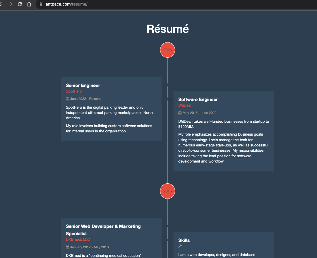
It looks great (at least, I think so). Except on mobile. Specifically, on Android running Chrome. The circle appears oblongly squished.

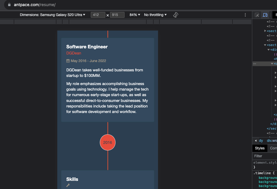
I could not recreate this bug on my laptop, even when I used Chrome Developer Tools to simulate mobile. Not being able to reproduce a bug consistently is a very frustrating experience.
USB debugging
I would have to use remote debugging via Chrome DevTools. The first step was to enable “Developer Options” on my Android device. I was using a S21 Galaxy Ultra. On this device I navigated to “Settings” -> “About Phone” -> “Software information”. Then I triple tapped the “Build number” and received a toast message “Developer mode activated”. This feels familiar, as it has been a similar process on previous Android devices that I have owned. I’d post a picture of my software information screen, but am worried that some of the data could be used maliciously by strangers on the internet.
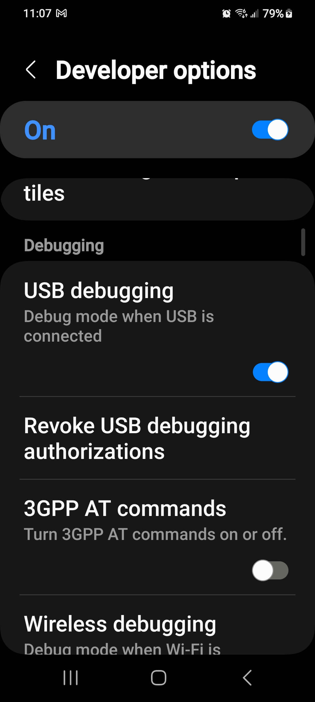
“Developer options” was revealed in my “Settings” app. From there, I could turn on “USB debugging”
Now, I could connect my Android to my MacBook. From my MacBook, I opened Chrome and navigated to chrome://inspect/#devices
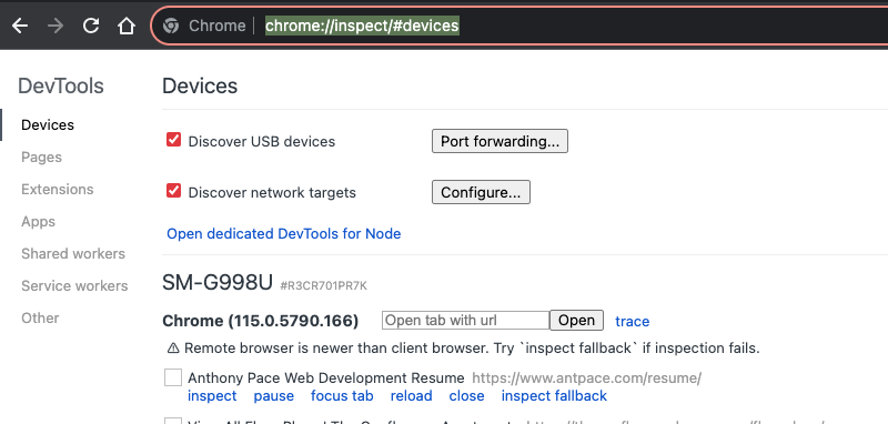
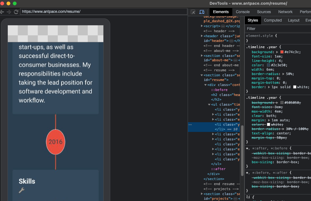
As long as my Android also had Chrome running, I could see my device listed with any open browser tabs. Clicking “inspect” opened a new window on my laptop that mirrored my cellphone’s screen. When I scrolled on one, it reflected on the other.
CSS Solution
I could inspect elements from the developer tools panel. This was exactly what I needed to debug the problem. And, the fix ended up being pretty easy. Here’s the original, relevant CSS:
.timeline .year {
  font-size: 1em;
  line-height: 4;
  border-radius: 50%;
  width: 6em;
}
The issue was ultimately with the width and height properties. The circles look correct on my desktop browser because the width and height rendered to nearly identical – 64px by 66px. To get a circle with CSS you need an element with the same height and width (the greater the difference, the less even and more stretched the circle appears), and then set the border-radius to 50%. On Android, that same element was being rendered as 64px by 85px. This was most probably happening because the height was not being explicitly defined.
As a remedy, I hard-coded the width and height properties. I changed the unit of measurement to pixels for both.
.timeline .year {
  font-size: 1em;
  line-height: 4;
  border-radius: 50%;
  width: 65px;
  height: 65px;
}
This fixed the circle from being stretched. But, now the text was not centered that way that it should be.
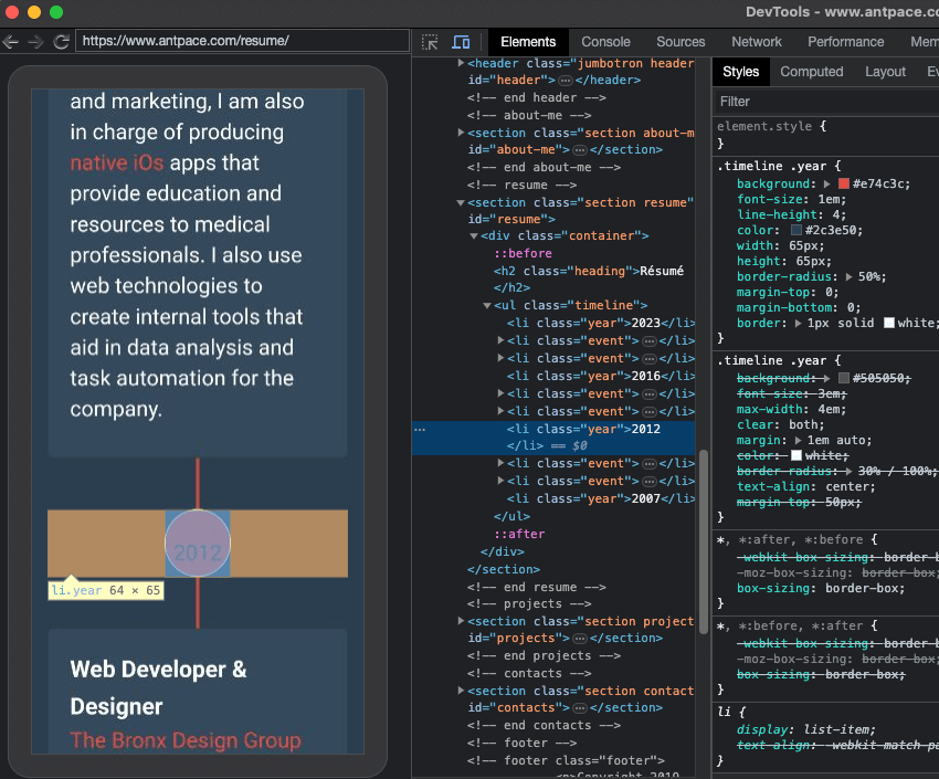
That was happening because of the line-height property. Since it was set without a unit of measure, most browsers would interpret it to mean a multiplier of the current font-size. And, the font-size was also using a relative unit of measure, em. Right away, that was a code smell. It was a browser issue, where along the way values were not being calculated as expected.
On mobile, the font-size was being calculated to 20.8px. On desktop, the font-was was being calculated to 16px. I fixed this by changing the line-height value to an absolute unit of measure:
.timeline .year {
  font-size: 1em;
  line-height: 65px;
  border-radius: 50%;
  width: 65px;
  height: 65px;
}
