Here’s a quick one about how to create a drop-down UI element with an arrow via CSS. The aim is to create a menu that has drop-down sub-menus. Each drop-down should have an arrow that points up towards the parent element.
Here’s the HTML to structure the menu:
<div class="menu">
  <div class="menu-item">
    <span>Menu Item</span>
    <div class="drop-down-menu">
      <p>Sub-item</p>
      <p>Sub-item</p>
      <p>Sub-item</p>
    </div>
  </div>

  <div class="menu-item">
    <span>Menu Item 2</span>
  </div>

  <div class="menu-item">
    <span>Menu Item 3</span>
    <div class="drop-down-menu">
      <p>Sub-item</p>
      <p>Sub-item</p>
      <p>Sub-item</p>
    </div>
  </div>

</div>
I nest the sub-menu within the parent item, and use CSS to show it when a user mouses-over:
.menu-item:hover .drop-down-menu{
  display: block;
}
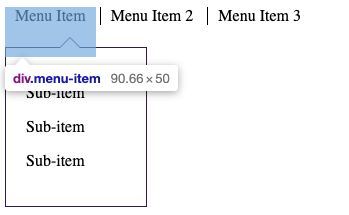
I line the menu-items in a row by setting display to ‘inline-block’. This is preferred over just ‘inline’, so that their height property is respected. This is important because I will create space between the parent item and sub-menu. If the two elements don’t actually overlap, then the hover state will be lost, closing the drop-down. See what I mean:

I also set the parent item position to relative, so that the drop-down will be absolutely positioned respective to it.
.menu-item{
  cursor: pointer;
  height: 50px;
  display: inline-block;
  position: relative;
}
Since the menu items have a height larger than the actual content, I apply borders to a child span within them:
.menu-item:first-child span{
  border:none;
}
.menu-item span{
  border-left: 1px solid black;
  padding: 0 10px;
}
The sub-menu styling is straight-forward. I set it to display: none, set a width, add a border and padding, and position it absolutely. Its top value pushes it off of the parent item a bit. Setting a left value to zero ensures that it will be aligned with its parent. (If you don’t set a left value, multiple sub-menus will all stack under the very first parent item.)
.drop-down-menu{
  display: none;
  width: 100px;
  position: absolute;
  background: white;
  border: 1px solid #301B46;
  padding: 20px;
  top: 40px;
  left: 0px;
}
The next step is building the arrow in the drop-down menu. The challenge is making the arrow’s border blend seamlessly with the container’s border. The illusion is achieved by overlapping the :before and :after pseudo-elements.
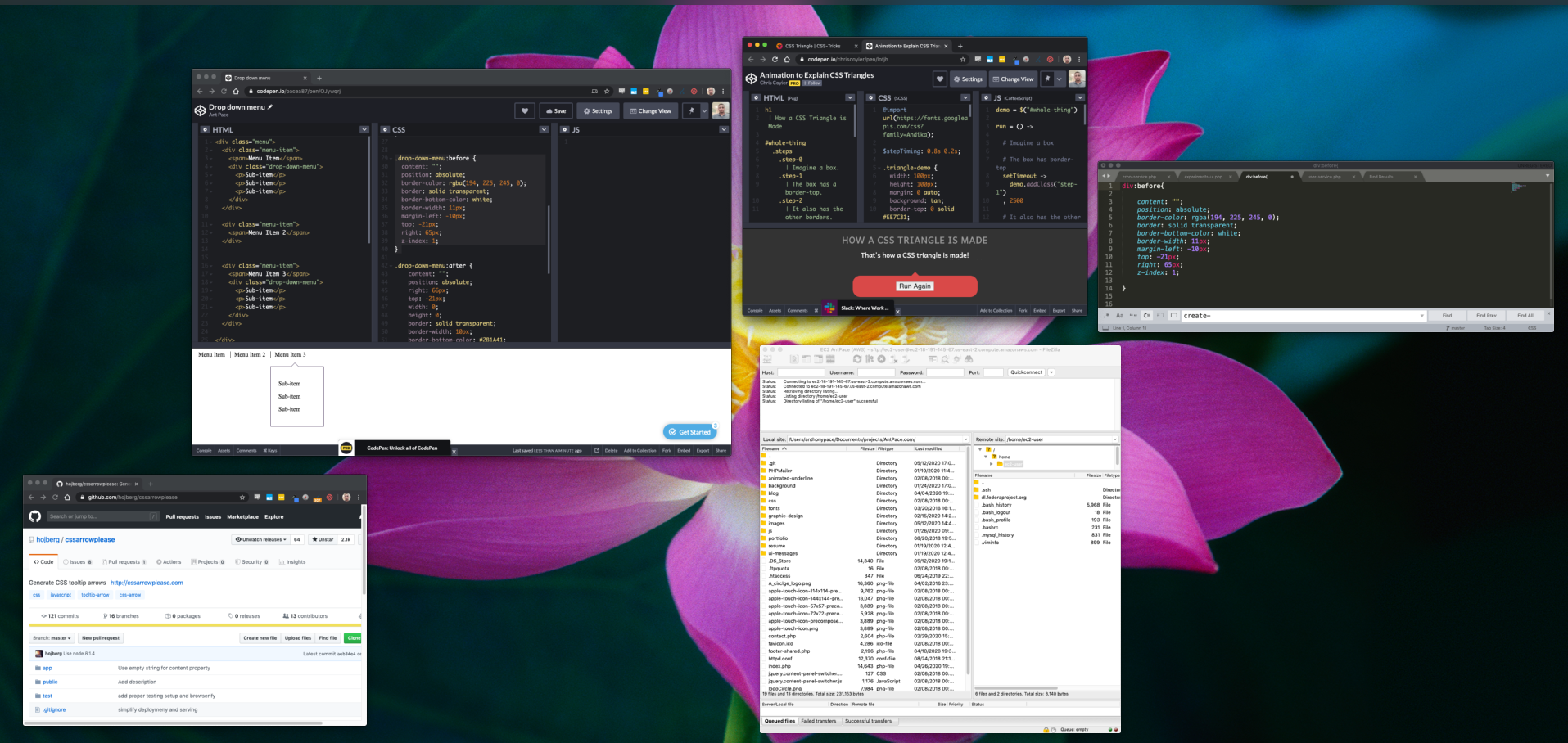
The triangle shape that forms the arrow is achieved by giving a bottom border to an element with no height or width. This code pen animation does a phenomenal job of explaining the idea: https://codepen.io/chriscoyier/pen/lotjh
The drop-down’s :before element creates the white triangle that is the heart of the arrow itself. This also creates the gap in the sub-menu’s actual top border
The :after element creates another triangle that is behind and slightly above the first one – creating the illusion of a border that connects just right with the menu’s.
The illusion can be better revealed by manipulating the position and border-width of these pseudo-elements in the inspector.
Here is the code I used for those pseudo elements:
.drop-down-menu:before {
  content: "";
  position: absolute;
  border-color: rgba(194, 225, 245, 0);
  border: solid transparent;
  border-bottom-color: white;
  border-width: 11px;
  margin-left: -10px;
  top: -21px;
  right: 65px;
  z-index: 1;
}

.drop-down-menu:after {
    content: "";
    position: absolute;
    right: 66px;
    top: -21px;
    width: 0;
    height: 0;
    border: solid transparent;
    border-width: 10px;
    border-bottom-color: #2B1A41;
    z-index: 0;
}
You can view the whole thing in action here: https://codepen.io/pacea87/pen/OJywqrj
Code generated from CSS Arrow Please helped me a lot when I was first figuring out how to do this right.
