Design
As programmers, we are creators and innovators. Design should mean more to us than just software architecture and “API design.” Graphic design, UI and user experience play a role in what we deliver as digital creators
- The importance of typography cannot be understated in design.
-
- Readability – cursive and serifs for headings; san-serif for body text
-
- Choosing font pairs is essential to ensure consistency and visual appeal.
When I first started doing freelance work (circa 2007) I was mostly a programmer, and had a hard learning curve for design. I made the mistake of randomly selecting unrelated fonts and slapping them together. One time, I designed ugly (in retrospect; at the time, I thought they were amazing) looking business cards for myself. I order 10,000 of them! I remember I ordered them from GotPrint.net after watching a YouTube video recommendation.
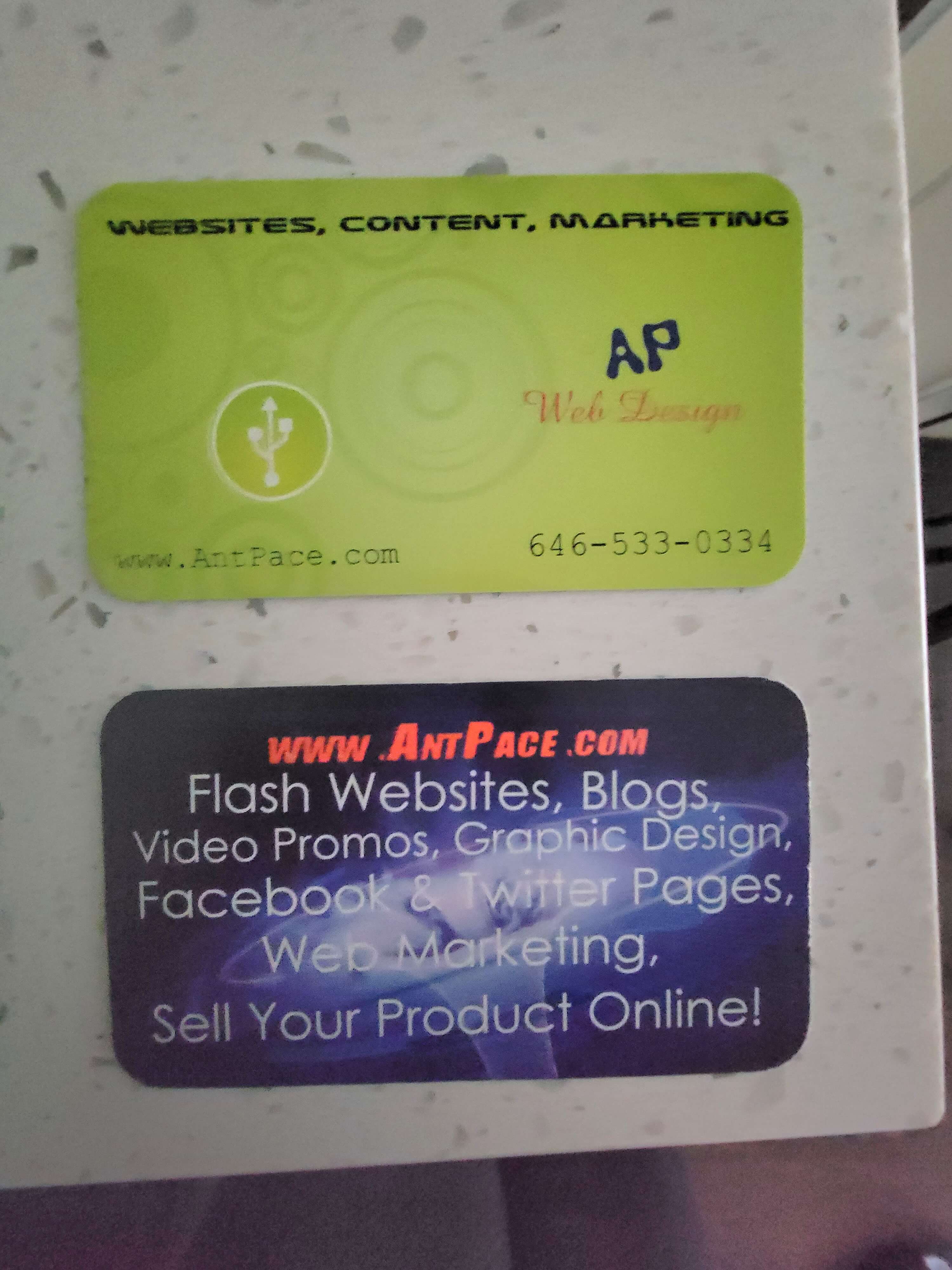
I got through maybe one thousand of them, ever. Until recently, I still had boxes of them stored in my parent’s basement, back in the Bronx. I keep a few in my archives just for memories.
- Subtle background patterns can enhance a design. For an example, checkout this website’s homepage.
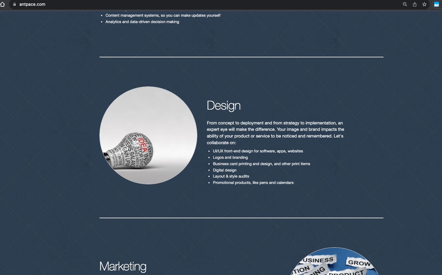
- Using an image as a background, especially if it’s blurred or darkened and turned black & white, can create a stunning visual effect.
- Adding icons to a heading is a way to make a design look more “finished”
- Using a white font with a semi-transparent black layer on top of the image background can make the text pop out and increase readability.
- I can achieve this effect using the GIMP. Once I have an image open, I add a new layer on top. I fill that layer all black. Finally, I lower the opacity of that layer to about 50%. You can see examples of this on www.SplitWit.com
- I can use CSS to add a transparent shadow to a div that has a background image (that is what I use on my portfolio page):
<style>
	.semi-trans-bg::before {
	  content: "";
	  position: absolute;
	  top: 0;
	  right: 0;
	  bottom: 0;
	  left: 0;
	  background-color: rgba(0, 0, 0, 0.5); /* Black with 50% opacity */
	}
	.semi-trans-bg p{
	   z-index: 1;
	   position: relative;
	}
</style>
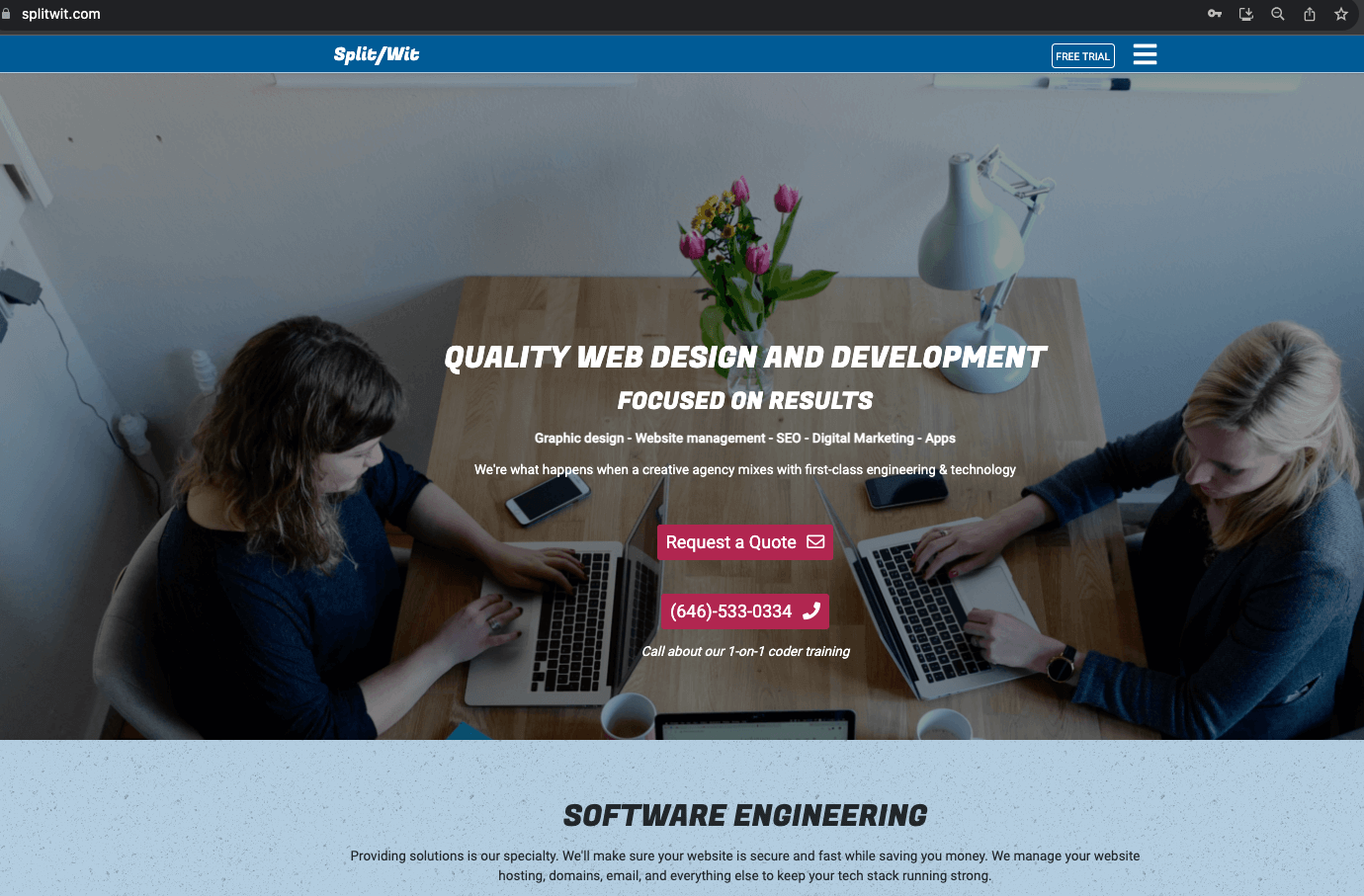
- For website design, the navigation often incorporates a hamburger menu for a cleaner look.
- When considering a logo, decide between using just text or incorporating an image for branding. Consider the “Anthony Pace” logo on this website.
- When design my own textual logo, the techniques I found most useful: kearning (letter spacing), drop shadows, and lighting effects.
- Using apps such as Canva makes it fun and easy. Is AI and automatic tooling replacing designers?
The logo that I use for this website (check the top-left menu, or my homepage’s hero space) has went through numerous iterations. I built it using the GIMP (which has been my tool of choice for over twenty years. I first started using it around 2002- and that’s when I learned that opacity is the opposite of transparency).
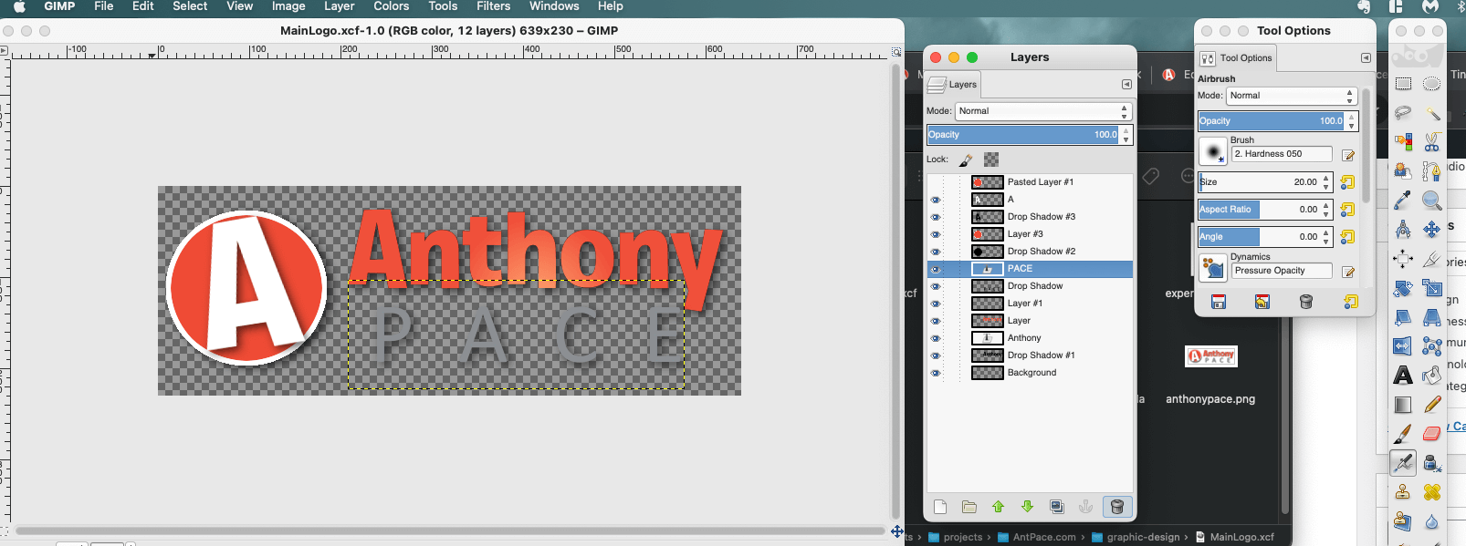
#todo: Add GIMP tutorials for techniques I often use. ie, Images with Text on top; The importance of padding.
An important typography technique I leveraged was kearning. I adjusted the spacing between the letters in my last name “PACE” to make it wider, and I used all capital letters. This gave it a sturdy feeling (something which I meant to convey). This formed a strong base for “Anthony” to balance on top of.
Each letter has a subtle drop-shadow, just barely noticeable, giving a *pop*. And the text center (check the “h” in “Anthony”) has a lighting effect (in GIMP, “Filters” -> “Light and Shadow” -> “Lighting effects…”) that draws attention.
Originally, the text logo (referred to as “wordmark” or “logotype”) I use today (circa 2024) was displayed next to a circled “A” (that I now use as the site’s favicon). Separating those two elements was a simplification that added a feeling of professionalism to my brand.
Pro-tip: Padding and whitespace is your friend. Avoid letting things look cramped – give your UI elements plenty of space to breathe.
You can see me employ some of these ideas on the YouTube screen recording embedded below. You’ll notice that in this version of GIMP (2024) to access the “alignment tool”, I need to first select the “move” tool, and then press “q” on the keyboard.
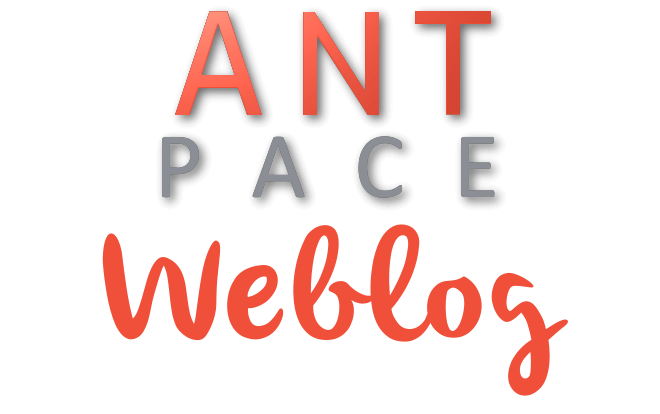
This same concept was stylized into many other renditions (see below). The fonts I used: Pacifico, Exo, Roboto. You can find artifacts of this throughout www.AntPace.com

To taste more of my design sense, check out my portfolio.
Libraries & other resources: FontAwesome, Bootstrap CSS, TransparentTextures.com, Stock Animation Clips at VideoPlasty
CLI design tools for programmers
The command line is a place where engineering and design blend like peanut butter and chocolate.
- Bulk converting images to a new format
- Identify unused image files in a code project
- Batch renaming and resizing image files
Creativity
In another post, I highlighted solutions I used to manage a large amount of content for a client project. I leveraged existing features and technology to achieve results in a unique way. Another way to put it: I used technical knowledge to overcome a problem, creatively. Some other examples of creative solutions include:
1) Using an existing CSS feature to deliver a better or unique user experience. When applying animations and effects, the possibilities seem limitless.
2) A doctor prescribing a drug, off label, to treat a problem for which it wasn’t originally intended.
3) A trained athlete combining existing techniques into a unique style.
Although creative, these examples aren’t innovative. Innovation creates something new and moves the world forward. It creates new products, new industries, and new markets. It takes existing concepts and rearranges them to fit a unique pattern.
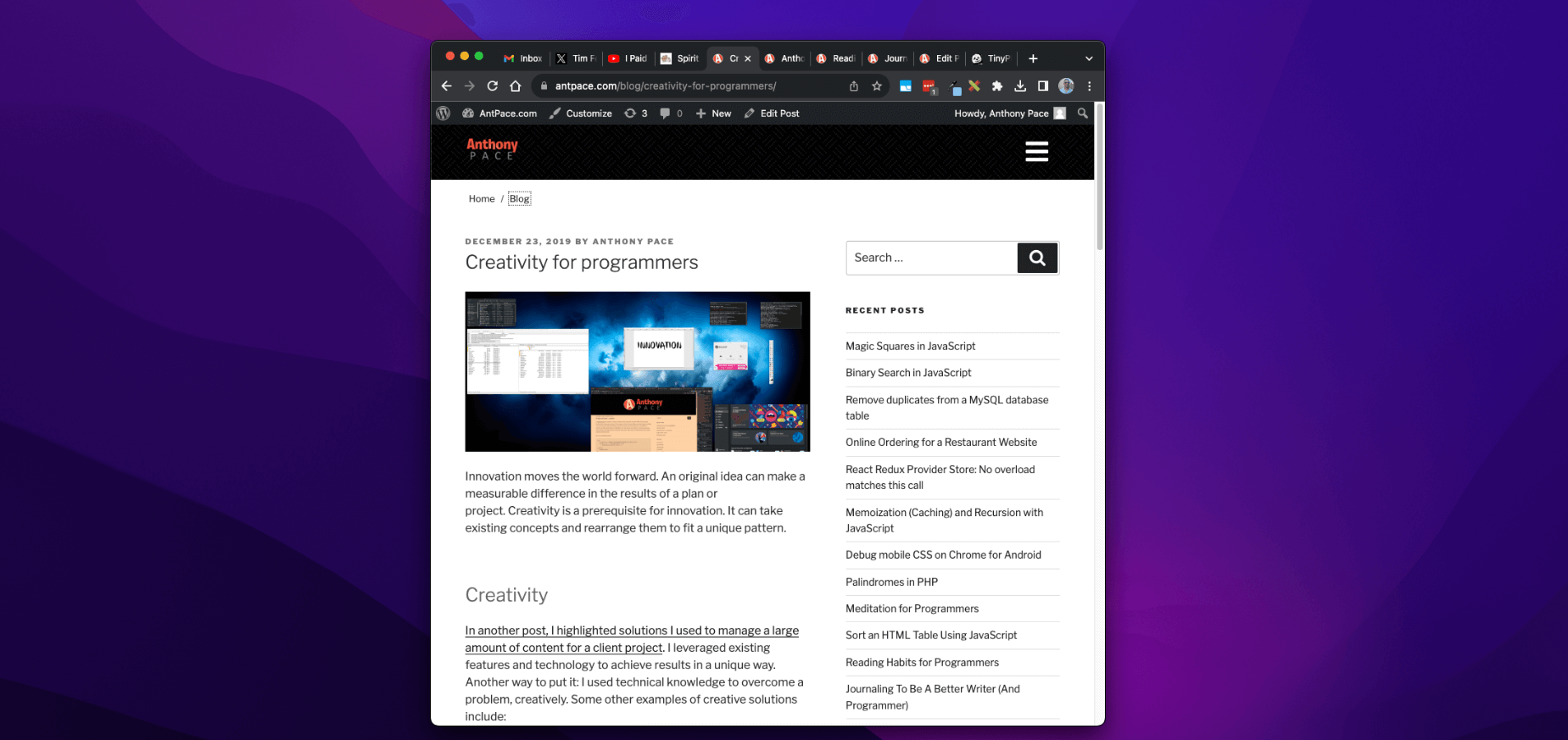
An outlet for my design creativity is the featured images used for each of my blog posts. Take a minute to scroll through them on my blog’s homepage. I usually take existing screenshots relevant to a piece’s subject matter, and juxtapose them against a desktop background. Sometimes, I create collages from random camera photos saved from old phones too.
Innovation
Innovation changes the space in which you’re working. In the next decade I will focus on that kind of growth, and expand past client-specific work. As a broad stroke, this means building digital products. Specifically, I’ll be taking the opportunity to solve problems in certain areas. Luckily, there are many exciting problems that need solving.
Innovative solutions require energy – and here are some places I’d like to spend mine.
1) Digital accessibility, and solving technology problems for people with disabilities. This will include software, as well as physical products. I’d like to explore how IOT, wearables, and augmented/virtual reality can be leveraged.
2) Privacy. This issue also seems to include homelessness, the justice system, and personal identity.
3) Business and marketing. These solutions are important, because I can re-use them as tools in other ventures. They can be leveraged to solve other important problems.
Working with Designers (as a programmer)
Receiving designs that don’t scale. Not having explicit designs for CSS break-points. Working with Figma. Using your best judgment as a front-end engineer.
* This post, like all of my blog entries, is a work-in-progress.
